Jan 21, 2015

design plan: dramatic, neutral living room

this client had an empty, neglected living room that needed some attention. 
here is the design plan i came up with to bring it to life!


interested in working together?
email me at autumnclemons@yahoo.com to get started!

Jan 17, 2015

one vintage nude, one minted.com abstract (art for the master bathroom)

adding the final touches on a bathroom is a bit liberating. all of the "hard stuff" has already been decided...vanity style, floor tile, shower tile, wall tile, plumbing fixtures, sinks, toilet, lighting.
it's already in place!
there aren't all THAT many decisions left to be made.

my master bathroom has a lot of marble in it. marble on the counters, marble on the floors, and marble on the walls around the shower and tub. that much marble has a certain coolness to it---both  visual and literal! i want to use some art work in here to add some warmth to the room. (i am thinking soft gold frames might be nice!)

i already have a vintage nude lithograph that i will frame and hang...
(you can read more about that here)

 i will also be looking to add another piece from minted.com. i became more aware of minted during the last round of the one room challenge, because they were one of the sponsors for the featured designers. i was floored by the selection and quality of the prints available! they not only have an incredible selection of art,  but they also carry fabric! (who knew, right? their fabric selection is like a pared down, curated selection of what is available at spoonflower.... without the weird jellybean, gargoyle, or cactus fabric to filter though!) minted also now carries save the date cards and supplies for your next party. GOOD stuff.

i spent some time on their site, considering options for my master bathroom. i want to keep everything neutral...there are so many textures in the room, and i want to keep everything monochromatic so that it feels more cohesive.

 i could stick with the nude theme and get this one:


or this one:


love the repetition and simplicity of this one:


the boldness of this one would stand up against the wallpaper:


but i also love a moody landscape, and this one is deliciously moody:


so many pretty choices! i may just have to get two...


this post was sponsored by minted.com

Jan 15, 2015

first look at my unfinished master bathroom

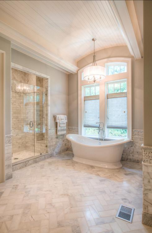
how about a little tour of my master bathroom? i haven't posted many pictures of this room ...well, because it's not DONE. yet. we already have a few projects scheduled for completion, and are hoping to have the room finished soon. 

this is the view looking into the master bathroom from the master bedroom:


the two doors on either side of the vanity are his/her closets. the two small doors straight ahead belong to a linen closet, and the door to the left is the american standard toilet.

overall, the bathroom is a dream! the bathroom functions wonderfully for us. 


i love the freestanding tub, walnut vanity, carrara marble herringbone floors, patterned marble/slate shower floors and large window.


some might criticize the fact that we only have a single sink in the vanity, but we have had 2 sinks in many previous homes, and found that we actually prefer more counter space over 2 sinks. 


on the TO DO list:
install shower walls and doors
*yah. its been a little DRAFTY taking showers in here for the last 18+ months!

install vanity mirror
this mirror will be a two way mirror, to allow the tv to be seen though the glass.
i can't wait to have a bigger mirror!! not only will it reflect more light into the room from the window, but it will also make getting ready a TAD bit easier.

install mirrors on linen closet doors
we knew we wanted these doors to be covered with mirrors when we built the house, so we specified smooth slab doors here. 

add crown moulding

paint walls

install light fixture (over the tub)
add some softness with a window treatment
hang art
hang towel hooks/rings

hang THIS wallpaper in the toilet closet
(cole & son lily wallpaper in black/bronze)
i fell in love the very first time i saw this wallpaper! its been sitting in my drawer for over a year now, and i am dying to get it hung! i will most likely hire someone to hang it for me...apparently, it needs to have liner paper hung first....not something i am excited about possibly messing up.


the shower doors and mirrors will go in this weekend, and the vanity mirror, sometime next week. i am just starting to consider fabric for the windows...right now, i am leaning towards a simple gray linen panel. depending on how quickly i can make decisions, this room should be pretty close to DONE in the next 4-5 weeks!


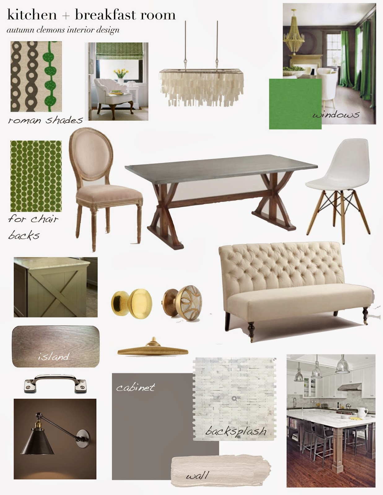
the design board i created for the bath:


and read more about the progress here and here and here and here.


Jan 13, 2015

affordable find: gold table lamp

this affordable find isn't going to save you hundreds of dollars (unless you a re going to buy like 5 of them!), but it IS going to save you SOME dollars!


devon table lamp
$199

ripley table lamp
$129

happy shopping!


Jan 8, 2015

"dead" design trends for 2015?

my husband brought my attention to a design-related article on yahoo.com yesterday. the title of the article was "design trends that are dead for 2015". usually, when i see these types of articles, i look over them briefly, and pretty much agree with everything. mostly because they list things like "wallpaper borders" or "chevron everything" , which in my mind were out years before the article was even written.
when i read THIS article, i was a....well, confused. and totally NOT in agreement with the "dead list".
i am going to paste the entire article here, so that you can see it, (including the pictures that were used.)
you will see my rants in red, just under each item!


Design Trends That Are Dead in 2015

Katie Brown

The start of a new year isn’t just the perfect time to get serious about fitness, health, career, and maybe even finding love.

It’s also a chance to dump some tired, tacky, and downright troubling design ideas and make a fresh start for your home. Yahoo DIY is here to help with 10 trends to banish this year (and beyond). Make up your own mind, of course, but don’t be afraid to toss out those old design ideas along with those 2014 calendars.

1. Smocked Bedding:


Because you do not want your bedding to look like old curtains from “Gone with the Wind” or a bridesmaid dresses that you never wear again.
OK. quite honestly..is this really a trend? i mean, yes, we see these duvets fairly often, and west elm, pottery barn,  and target all have their versions of this look, but anyone with a (AHEM) *messy teenage girl, would see this as an awesome solution to an always-wrinked-anyway bed situation. yah. that would be me. 
so...say it is a trendI'm still not hating it enough to be over it. maybe i am off on this one. but just read on. it gets better.


2. Tile and Marble Everywhere:

image
(Photo: Home Bunch)

YES! You can have too much of a good thing.
UH, did she really just say that? having tile on your floors and walls AND shower is TOO much? i totally disagree. i think this is a classic look that will always be in style. and i am sorry, but she should have tried a LOT harder to find an uglier picture of this "trend". i mean, this bathroom is pretty dang nice, and i would venture that just about anyone would agree that it doesn't feel overdone.

3. ALL One Color ALL the Time:

image
(Photo: Mel Cleaning)

Shake it UP! Because this gets old so fast. You have to have varied shades and colors in a room to keep it feeling alive!
so...not sure how i feel about this "dead trend"...i mean, i happen to like the use of a single color in a space. several shades of a single color can add a lot of depth and interest to a room, and i don't see this approach to interiors a trend. some of the most beautiful rooms i have ever seen are rooms in which a single color is used judiciously and expertly, to yield dramatic and beautiful results.


4. Indoor Hammocks:

image
(Photo: LibroDeSecretos)

Hammocks should stay outside. It takes up way too much room and makes it nearly impossible to create a nice flow through a room.

did anyone else realize this was a trend? 


5. Fake Canopy Beds:

image
(Photo: Bark & Linen)

They are just wrong. There are so many more interesting ways to highlight a bed.


yah. this is where i started getting a little HEATED. i mean, just LOOK at this picture she used to illustrate this "trend"! that bedroom is amazing on so many levels, i barely know where to begin. for REAL, katie brown? and since when are canopy beds a trend? or "wrong"? ugh. am i totally out of touch or is this a little weird?


6. Taxidermy:
image
(Photo: Sojorner)

The days of having dead things gazing down at you are over. This décor idea can really pull focus in a room and drown everything else out. Taxidermy is literally and figuratively DEAD.

sure, i will give her this one. i mean, it works in some spaces, but when someone slaps an animal head up on their wall 'JUST because', it can look trendy and tacky, but in a LOT of cases it can look great.


7. Chalkboard Paint Walls:

image
(Photo: Nellie Bellie)

They have become so grating that when they are spotted in a room you can hear the nails running down them. Enough already. This trend is way overplayed.

true. definitely a trend. i don't hate chalkboard walls, but i can see how it is getting a tiny bit predictable. this isn't a look that i think will vanish overnight...or possibly EVER, but trendy? yes. sure. 


8. Too many textures in one room:

image
(Photo: Lushome)

Because nothing can make a room more confusing and overworked. The chaos is exhausting.

dont agree with this at all. i mean, texture is a major design element that can bring variety and contrast to a room. not sure why she thinks that too many textures can be "confusing" and "overworked" and "exhausting". i like texture. i embrace it. 


9. Painting just one “accent” wall.

image
(Photo: Apartment Therapy)

Make up your mind! If you do not like the color enough to use it on all the walls then just skip it. Nothing breaks up a room more than a disjointed choice like this one.

i have never really been on board with this look. i feel like this was "trendy" 8+ years ago. i try to avoid the contrast accent wall almost always, but i have to admit, that it can look good in certain applications. 


10. Sentiment on Canvas:

image
(Photo: Stephanie Lynn)

NO MORE preachy words on wall art. No one wants a décor accent to tell him or her how to feel. DONE DONE DONE.


again, not my personal favorite trend, and not something you would see in my home, but is it just me, or are her words a bit STRONG?

(PS--i am pretty sure the last time i *TRIED to watch the katie brown show she was doing some gag-inducing craft like making pretend sunflowers out of paper plates and egg shells or some other nonsense! no thanks.)

i don't know folks. what are your thoughts on this article? in my mind, she was pretty far off. 
am i crazy??

please, please chime in. 
this has been bugging me. UH-LOT.
i NEED your feedback!


Jan 5, 2015

design plan: kitchen + breakfast room with touches of kelly green

well. HAPPY NEW year!
and, merry christmas. 
i know, i know. i did it again. i took a crazy long break from my blog. but sometimes i just need to disconnect. its good for me. and i don't every want this blog to be a place where i sell you stuff i don't care about, and post a bunch of pictures just to have a post up. 
it's not me.
want to know what IS me?

mixing super affordable stuff with just the right amount of more expensive stuff to get an eclectic, layered room that reflects the personality of whoever lives in the home.

i wanted to start the new year by sharing a few pages for a full room design that i worked on for a friend and client. as with many clients that i work with, my friend is on a budget, and wanted a plan that would allow her to work on the rooms in stages. 
one awesome thing about this client is that she is totally on board for a splurge on designer fabric, which, in my opinion, can quickly elevate a room from "nice" to "fabulous".

here is the plan i came up with for her kitchen and breakfast room:


the floor plan, showing the enlarged island and new cabinetry in the dining area.


i also drew up a very basic model for the new island, which will include a microwave, pull out trash can, seating, and pantry storage.


one of the biggest changes in this space will be the new built-in, which will house a cookbook library, a coffee station, a buffet serving area, and some pull out food trays for the couples beloved pugs.


thanks for hanging in there with me! i know i don't post a ton, but when i do, i hope you find the content meaningful and inspiring.
have a happy, happy monday!