as a reward, we told her we would plan a trip for just her and one (or both) lucky parents. she worked her tail off, and pulled through, getting straight A's!
we had several options that we were considering for the trip, but in the end, olivia chose jamaica. last weekend, she and i took off for our adventure.

once we narrowed down the area and type of resort we were interested in, (all-inclusive but not too expensive and not too old, with good reviews) the final choice was easy to make!
i chose the royalton white sands in montego bay jamaica, not only because of the trip advisor reviews, but also because of the modern, updated design.
here is a peek at the resort, starting with the lobby:

as with many carribean hotels, the lobby is compteley open air. the lobby at the royalton has a round center area with and enormous glass sculpture in the middle. (sorry i didn't get a better picture, i was too busy gawking!)

the columns light up in the evening, which gives the entire lobby a soft glow.


these live edge benches were really beautiful.


loved the wood treatment on the reception desk!


there were so many whimsical, sculptural details that were so well done and added so much to the space! the gold wallpaper was subtle and added just enough glimmer.

i really loved the applied organic-looking treatment on the facade of the halls.

just like the lobby, the hallways were open air, which provided for some amazing views we were walking to and from our room.
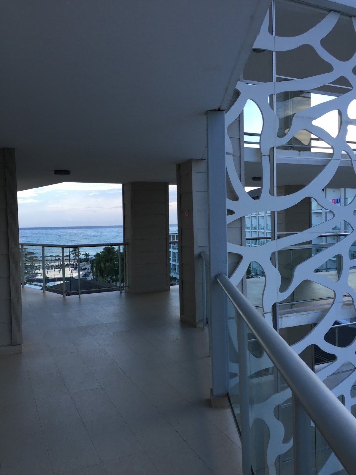


look at that view!
it never got old.

the resort was laid out really well. it was easy to get around, felt very upscale and tropical and we could get anywhere in just a couple minutes walk.

the hotel was actually purchased by new owners and extensively remodeled recently. they kept the same "x" shape of the original main building, but completely revamped the exterior, and added on several other buildings, . i think they did a tremendous job of tying the old and new buildings together architecturally, and adding character and interest!


the built in along this wall had a desk area, a fridge, as well as a place to put luggage/bags and shoes.
i wasn't 100% on board with the lighted coral thing above the bed, but it did provide a nice effect when it was on.


the bathroom was also really modern and well designed.

a few other details i LOVED:
the ceiling in the buffet restaurant. so fun!

the tufted harlequin treatment in the sports bar.


totally cool outdoor seating.


and i gasped when i saw this vignette on the wall!

isn't this awesome?

i also loved that the mirror was layered...i mean, who really wants an accurate reflection of how they look after a few hours at the beach and pool? complete genius.

each of the stalls, had a framed shadow box with shells or starfish.


the "zen" restaurant was set in the middle of the resort, surrounded by water. there was a bridge that you crossed to enter.

the lighting was insanely good!

the carved wooded screens were painted gold.

and...HELLO! this mosaic was breathtaking!


the exterior walking areas were covered with this porous limestone that occasionally had shell and leaf fossils.


the view from the pool wasn't so bad either!


this wall treatment in the hallway on the main level always made me smile.

the ceiling was super fun too!

the design team did an amazing job of dressing up the ceilings in here.

the lighting was nice too!

these lights, in the same area, but above a bar are meant to resemble bird cages.
how fun is that?


(aren't those "pods" great? they create intimacy, and add texture and interest.)

it was hard to get a great shot of the scale of these lights. they were tremendous!


cement tile on the wall, also repeated in the entry.

i think some people get really hung up on mixing patterns and textures, but if you look at the tile, the ceiling and the wood screen in this alcove, you can see that while there is "a lot" going on, the overall effect is really interesting and beautiful!

overall, the trip was amazing! olivia and i made some great memories, and i loved the service and design of the resort.
hope you can get some inspiration just like i did from this stunning place!


